Modern optimization strategies for loading web fonts
Last Updated: May 3, 2022
Introduction
For consistency and better UI/UX, we often need to use custom fonts for displaying various kind of texts of our web application.
These custom fonts are generally not available on user's devices and so they get downloaded along with the web page. These custom fonts getting downloaded along with the web page are called web fonts.
As web fonts need to get downloaded before showing the text with that font, it creates some challenges in using them.
Let's discuss about those challenges and how to solve those challenges in this article.
Challenges in using Web Fonts
1. Browser Inconsistencies
Different browsers have different default behaviors regarding how to render text when web font is being downloaded. This results in inconsistent UX across different browsers.
2. FOIT Issue
As mentioned in 1st challenge, Chrome/Firefox renders invisible text for initial few seconds and Safari renders invisible text until font is downloaded. This creates FOIT (Flash of Invisible Text) issue as shown in below video.
If we use web font for main body text, then this can also result in larger value of important web vitals such as First Contentful Paint(FCP) or Largest Contentful Paint(LCP) and that results in bad UX and SEO scores.
3. FOUT Issue
As mentioned in 1st challenge, when the web font gets downloaded, Chrome/Firefox/Edge swaps the fallback system font with the web font. This creates FOUT (Flash of Unstyled Text) issue as shown in below video.
As whole layout can get impacted due to FOUT, it creates bad UX and it increases value of another important web vital called as Cumulative Layout Shift(CLS). This also creates bad impact on SEO score.
4. Delayed LCP
Downloading of web font shares bandwidth with other resources of the web page. Due to that it may increase the time for Largest Contentful Paint (LCP). To have lesser impact, we need to keep web font payload as minimum as possible.
Summary
To use web font, we need to keep the effect of FOIT and FOUT to minimum, so that the score of important web vitals FCP, LCP and CLS remain in acceptable range.
Now, let's start exploring about various font loading optimization strategies to minimize effect of above challenges.
Font Loading Optimization Strategies
1. Self host the web fonts
There are mainly two ways to load web fonts in our web page.
-
Load from online font services such as Google Fonts, Adobe Fonts, typography.com etc. Out of these services, Google Fonts provides free service to load open source fonts and so it is very popular among all other services. In this article we will use Google Fonts service only to compare it with self hosted font solution.
-
Self Host
Let's first understand about what optimizations are done by Google Font service so that we can self host web fonts by accommodating most of those optimizations and avoid disadvantages of using Google Font service.
Optimizations done by Google Fonts
Google Fonts is doing below optimizations by default when we load font from it:
- It automatically loads best supported font for the user's Operating System and Browser.
- It provides font from fast Google CDNs.
- It automatically delivers to the supported OS and browser, which reduces overall font payload for the web page when multiple font styles are used on that page.
- It implements subsetting of font and so it delivers font with only charsets used on web page. This reduces font size significantly.
- It supports to allow author of the web page to control behavior of FOIT and FOUT.
Why to self host the web fonts
Now, you may be wondering if Google Font is doing so many web font loading optimizations, then why should we self host the font.
Well, I prefer to use Google Font for quick prototypes or small side projects but for any serious web application, I prefer to self host the fonts due to below reasons:
- We cannot google fonts for quicker font loading because font urls given by google fonts are not stable and it can get removed or updated frequently as mentioned in this talk from Google. To preload web fonts, we need to self host them.
- Though google CDNs are very fast and stable, in case of any issue with those CDNs, our site can get impacted directly. When we host the font on our server, which has http/2 support, the font loads speedily as well and it provides extra stability to our website due to non-dependency on third party website.
- If google updates the font on its server, our web page layout may get impacted some way, about which we may not get aware instantly. Instead it feels safer to update font manually and test our application before pushing the changes to production.
- While using Chrome browser before October 2020, if user visits Website A having font from Google Fonts and then if user visits Website B, which uses the same font from Google Fonts, then Chrome browser was pulling the font from the browser cache instead of downloading it again from the google server. That was giving good performance when we load any popular web font.
But, from October 2020 (Chrome v86), google has enabled Cache Partitioning feature. Due to that, cache cannot be shared between two websites and so each website needs to download the font. Safari already has "Cache Partitioning" feature enabled since 2013. So, now we do not have that important performance benefit of loading google web font from cache. - While self hosting also, we can implement all the optimizations done by Google Fonts service but that will be manual work 😉
In summary to have complete control over web font loading, I prefer to self host the fonts rather than using any third party service.
Though if you prefer to continue using Google Fonts service, then also some of the optimization strategies mentioned in this article can be useful.
Now, to self the font, first we need to decide which font formats to use and how to download font in those formats. So, let's explore about that.
Which font format to use
There are many different font formats such as , , , and .
WOFF and WOFF2 are primarily designed to work for web pages as they provide compressed fonts. That means these fonts are smaller in size than others. Among WOFF and WOFF2, font size of WOFF2 is around 30% lesser than WOFF fonts.
Currently WOFF2 has very good support across different browsers and Operating Systems. So, it is preferable to use WOFF2 font format to self host fonts.
If we need to support IE or old Mac OS versions, then we can host WOFF format also along with WOFF2 to have better compatibility.
How to download WOFF/WOFF2 fonts
If we want to self host any font from Google Fonts, then we can download google fonts in WOFF/WOFF2 format using Google Web Fonts Helper web application as shown in below video.

But, if we need to self host any custom font which is not available on Google Fonts service and if they are in TTF/OTF formats, then we can manually compress it to WOFF and WOFF2 formats using tools such as Webfont Generator, woff2 etc.
How to self host web fonts
Once you have downloaded necessary font files, just put those files in any publicly accessible path on your server.
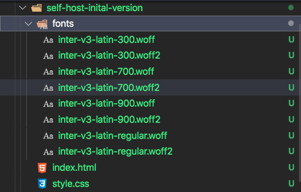
After that add @font-face rules for all those fonts.
For example, if we have downloaded "Inter" font of weight 300, 400, 700 and 900 from Google Web Fonts Helper, then @font-face rules can be as follows:
<html>
  <head>
    <style>
      /* inter-300 - latin */
      @font-face {
        font-family: "Inter";
        font-style: normal;
        font-weight: 300;
        src: url("/fonts/inter-v3-latin-300.woff2") format("woff2"),
          url("/fonts/inter-v3-latin-300.woff") format("woff");
      }

      /* inter-regular - latin */
      @font-face {
        font-family: "Inter";
        font-style: normal;
        font-weight: 400;
        src: url("/fonts/inter-v3-latin-regular.woff2") format("woff2"),
          url("/fonts/inter-v3-latin-regular.woff") format("woff");
      }

      /* inter-700 - latin */
      @font-face {
        font-family: "Inter";
        font-style: normal;
        font-weight: 700;
        src: url("/fonts/inter-v3-latin-700.woff2") format("woff2"),
          url("/fonts/inter-v3-latin-700.woff") format("woff");
      }

      /* inter-900 - latin */
      @font-face {
        font-family: "Inter";
        font-style: normal;
        font-weight: 900;
        src: url("/fonts/inter-v3-latin-900.woff2") format("woff2"),
          url("/fonts/inter-v3-latin-900.woff") format("woff");
      }
    </style>
  </head>
  <body>Hello World</body>
</html>
As you can see that we need to download font files for each separate font styles and add @font-face rules for all of them. This can increase overall font payload for our website if we need to use multiple font styles. But, now a days a better alternative is available and that is Variable Fonts.
2. Use variable fonts
Variable font comes with a single file and it can have multiple axis of variations. That means it can have "weight axis", "italic axis", "slant axis" etc. for different variations of the font. Different fonts have different axises by which we can change font styles.
You can find all the open source variable fonts and their supported axis at google variable fonts.
The other benefit of variable font is that, you can have any intermediate value of the axis. For example, for normal fonts, we usually have font weights in increment of 100 such as 100, 200, 300, 400 etc. But in case of variable font with weight axis, the font-weight value can be 450, 625, 810 etc.
For example, Inter font has two axis: weight and slant. Weight axis can have minimum value of 100 and maximum value of 900, while slant axis can have minimum value of -10 and maximum value of 0. We can use any value between min and max of the respective axis.
Inter Font
Weight400
Slant-5
How to download variable font
If you have downloaded custom font from source other than Google Fonts, then the downloaded pack may contain variable font version of the font.
As of writing this article, Google Fonts or Google Web Fonts Helper tool does not provide variable font to download.
So, if you want to use any open source variable font from Google Fonts, then you can follow this step-by-step tutorial on how to download variable font from Google Fonts.
How to use variable font
Put the downloaded variable font file in any publicly accessible path on your server.

After that add @font-face rules for the variable font as shown below:
<html>
  <head>
    <style>
      @font-face {
        font-family: "Inter";
        font-style: oblique 0deg 10deg; // specifies range of slant axis
        font-weight: 100 900; // specifies range of weight axis
        src: url("/fonts/inter-latin-variable-full-font.woff2") format("woff2");
      }
    </style>
  </head>
  <body>Hello World</body>
</html>
Now, you are ready to use the Inter variable font. Just set it as font-family on any element or on whole body.
body {
  font-family: "Inter", sans-serif;
}
Performance comparison
From below video comparisons, we can see that using variable font reduces number of layout shifts. It also decrease time to get page ready because of lesser number of font file requests and so lesser bytes to be downloaded.
Comparison of various metrics measured in Chrome is as follows:
| Self host Variable Font | Self host Normal Font | |
|---|---|---|
| FCP | 2.366s | 2.455s |
| LCP | 2.366s | 2.454s |
| CLS | 0.008 | 0.003 |
| TBT | 0ms | 0ms |
| Page Size | 60KB | 77KB |
| Load Event | 4.365s | 4.828s |
3. Use appropriate font-display value
In challenges section of this article, we understood that browsers have some default behavior about rendering text when font is being downloaded. This default behavior may not always proper for our application.
For example, if we are creating application where user is going to read article/content etc., then it may create bad UX due to layout shift if the downloaded font is swapped after user has started to read the article. Also, in such application, it is better to show the text as soon as possible rather than waiting for our web font to get downloaded.
Internally browsers implement font-display timeline with three time periods.

- Font Block Period: During this time period, if web font is not loaded, then browser shows invisible text.
- Font Swap Period: During this time period, text gets rendered in fallback system font until web font is loaded. Once web font is loaded, browser swaps fallback system font with the web font.
- Font Failure Period: If web font is not loaded, then browser marks it as failed font loading and continue to show fallback system font.
By default different browsers has different time for such periods which results in different default behaviors as we discussed in challenge 1.
CSS provides font-display property, which we can use in @font-face rule to make this time periods consistent across browsers. Possible values for font-display property are as follows:
auto:
This keeps default behavior of the browser for loading web fonts as we discussed in challenges section.
block:
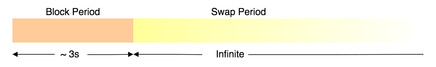
This sets small block period (~ 3s) and infinite swap period.
That means browsers will show invisible text until the web font is downloaded for maximum first 3s.
After 3s also, if the web font is not downloaded, then browser will render text in fallback font and whenever the web font is downloaded, it will swap the fallback font with the web font.
If we set font-display: block for body text, then on slower networks it can result in considerable FOIT and FOUT issues and larger time of FCP/LCP for the web page.
Use it when,
- we cannot show the text in fallback font and it is must to show it using the web font.
- Flash of Invisible Text (FOIT) is acceptable
Usage Examples:
- Font Icons
swap:
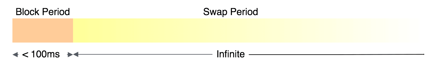
This sets very small font block period (< 100ms) and infinite font swap period.
That means, browsers will show invisible text until the web font is downloaded for maximum first 100ms.
After around 100ms, if the web font is not downloaded, then swap period starts and browsers will show fallback font.
In swap period, whenever the web font is downloaded, it will swap the fallback font with the web font.
If we set font-display: swap for body text, then on slower networks it can result in considerable FOUT issue and larger value of CLS metric.
Use it when,
- it is mandatory to eventually render text using the web font.
- it is acceptable to have Content Layout Shift (CLS) when the font is swapped.
Usage Examples:
- Enterprise applications where we want that our application should look same for every user
- Applications serving to people with overall good internet connectivity
- Logo text
fallback:
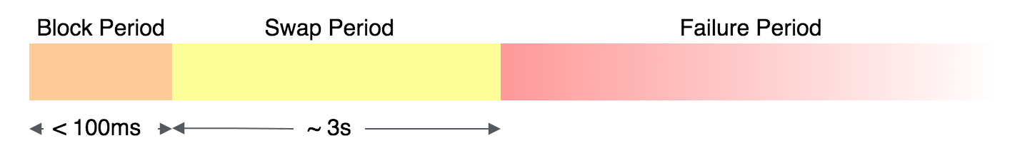
This sets very small font block period (< 100ms) and small font swap period (around 3 sec).
That means, it will show invisible text until the web font is downloaded for maximum first 100ms.
After first 100ms, if the web font is not downloaded, then swap period starts and it will show fallback font.
If the web font is downloaded within 3s of swap period, then it will swap the fallback font with the web font.
But, if the web font is downloaded after the 3 sec of swap period, then it will not use the web font and keep on showing the fallback font.
Though the downloaded web font can get stored in browser cache and on next page load, it can use the web font.
If we set font-display: fallback for body text, then on slower networks it will have relatively less considerable FOIT/FOUT issue.
Use it when,
- it is better to render text using web font but not mandatory.
- we do not want to have CLS, due to font swapping, much after user has already started using the web page.
Usage Examples:
- Blogs
- News portals
optional:

This sets very small blocking period (< 100ms) and no swapping period.
That means, it renders the web font only if it is available very quickly when the page renders.
If the web font is not available within first 100ms, then browser will render the text in fallback font and it will never swap it with the web font.
Though when next time user visits the web page, web font may get rendered as it might have been cached in the browser.
If we set font-display: optional for body text, then on slower networks it will not have any noticeable FOIT/FOUT issue.
Use it when,
- it is better to render text using web font only if internet is very fast
- it is completely fine to render text with fallback font
- we want no FOIT and FOUT issues
Usage Examples:
- Nice-to-have decorative texts
- Websites targeted for slow internet areas because when we use
font-display:optional, browser can even skip to initiate font download request on slow networks and thereby it can save bandwidth.
How to set font-display
/* latin font only */
@font-face {
  font-family: 'Inter';
  font-style: oblique 0deg 10deg;
  font-weight: 100 900;
  font-display: fallback;
  src: url('/fonts/inter-latin-variable-full-font.woff2') format('woff2');
}
Performance comparison
From below video comparisons, we can see that when we use font-display: fallback, period of FOIT is decreased significantly than before.
In below video, this effect is visible only in Firefox because Firefox has default font block period of around 3s, while Chrome has very little default font block period.
Comparison of various metrics measured in Chrome is as follows:
| Self host Variable Font + Fallback font-display | Self host Variable Font | |
|---|---|---|
| FCP | 2.325s | 2.366s |
| LCP | 2.408s | 2.366s |
| CLS | 0.008 | 0.008 |
| TBT | 0ms | 0ms |
| Page Size | 60KB | 60KB |
| Load Event | 4.446s | 4.365s |
| Font Swapped At | 4.25s | 4.1s |
We have reduced effect of FOIT by using font-display CSS property, but we still have delayed FOUT issue (fonts get swapped at around 4.25s in Chrome).
Let's try preloading our web font and see if it can help in reducing FOUT issue by swapping the font sooner.
4. Preload web fonts
When we load the web page, first HTML gets parsed and then get loaded and parsed. By default web fonts starts getting downloaded after render blocking resources are loaded and any HTML element using that font is found. This can result in our font getting downloaded late and it can result in delayed font swapping time and so creates considerable FOUT issue.
But, if we are sure that we are going to need the web font for our web page, then we can start preloading the font. This way we can make font available quickly to our web page and our web page can have reduced FOUT issue.
To preload web font, we just need to add <link rel="preload"> tag in <head> tag of our html page.
<html>
  <head>
    <link
      rel="preload"
      href="./fonts/inter-latin-variable-full-font.woff2"
      as="font"
      type="font/woff2"
      crossorigin="anonymous"
    />
    <style>
      @font-face {
        font-family: "Inter";
        font-style: oblique 0deg 10deg;
        font-weight: 100 900;
        font-display: fallback;
        src: url("./fonts/inter-latin-variable-full-font.woff2") format("woff2");
      }
    </style>
    <link rel="stylesheet" href="./style.css" />
  </head>
  <body>Hello World</body>
</html>
Note that here it is necessary to set crossorigin attribute to preload font. Without this attribute, preloaded font is ignored by the browser and we will end up with loading font two times. One during preload and another when it is discovered by our CSS.
Performance Comparison
Let's see how our web page is loading after preloading the font.
Comparison of various metrics measured in Chrome is as follows:
| Preload Self host Variable Font + Fallback font-display | Self host Variable Font + Fallback font-display | |
|---|---|---|
| FCP | 3.503s | 2.325s |
| LCP | 3.503s | 2.408s |
| CLS | 0 | 0.008 |
| TBT | 0ms | 0ms |
| Page Size | 60KB | 60KB |
| Load Event | 4.641s | 4.446s |
| Font Swapped At | 3.5s | 4.25s |
It is surprising to see that when we preload the font, we do not get any FOIT or FOUT but as a side effect, it has increased time of FCP and LCP considerably, which is bad for SEO.
The reason for delayed FCP can be found from below interactive image comparison.
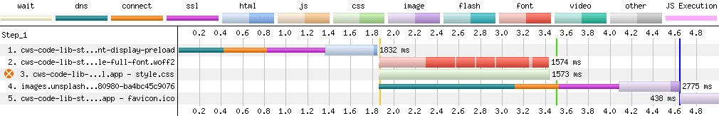
From above image comparison, we can see that when we preload the web font, the style.css file took longer time to load because now the bandwidth is shared for loading both font and CSS files at the same time.
As this CSS file is a render blocking resource, our web page is not getting rendered and that results in increased value of FCP/LCP.
To solve this issue, we can implement one more optimization technique. That is to inline all critical styles.
Inline Critical Styles
CSS files getting loaded from <head> tag of html page blocks rendering of the whole web page. So, to avoid that issue:
- we can copy all the and put it directly in
<style>tag of our HTML page - keep all the non-critical styles into separate CSS file and load it asynchronously, so it does not block page rendering.
You can learn more about this technique in deferring non-critical CSS article.
As in our sample application, all the styles are important for above the fold page rendering, we will copy all the styles from CSS file to HTML file. This is also called inlining styles.
<html>
  <head>
    <link
      rel="preload"
      href="./fonts/inter-latin-variable-full-font.woff2"
      as="font"
      type="font/woff2"
      crossorigin="anonymous"
    />
    <style>
      @font-face {
        font-family: "Inter";
        font-style: oblique 0deg 10deg;
        font-weight: 100 900;
        font-display: fallback;
        src: url("./fonts/inter-latin-variable-full-font.woff2") format("woff2");
      }
      body {
        font-family: "Inter", sans-serif;
      }

      .default-text {
        font-family: sans-serif;
        border: 3px dashed grey;
        padding: 15px;
      }

      .text-light {
        font-weight: 300;
      }

      .text-bold {
        font-weight: 700;
      }

      .text-extra-bold {
        font-weight: 900;
      }

      .text-italic {
        font-style: italic;
      }
    </style>
  </head>
  <body>
    <!-- Not showing full HTML code for brevity -->
    Hello World
  </body>
</html>
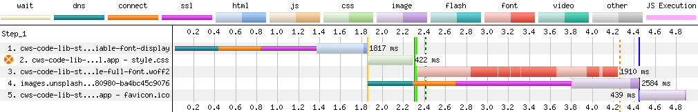
Performance Comparison
Now, let's see the impact of preloading the font after inlining styles.
Comparison of various metrics measured in Chrome is as follows:
| Inline Style + Preload Self host Variable Font + Fallback font-display | Self host Variable Font + Fallback font-display | |
|---|---|---|
| FCP | 2.068s | 2.325s |
| LCP | 2.068s | 2.408s |
| CLS | 0.008 | 0.008 |
| TBT | 0ms | 0ms |
| Page Size | 60KB | 60KB |
| Load Event | 4.419s | 4.446s |
| Font Swapped At | 3.6s | 4.25s |
As you can see that after preloading the web font and inlining the styles, FCP/LCP is reduced considerably and fonts are getting swapped much sooner than before. That means overall we have decreased impact of FOIT and FOUT and also able to achieve faster FCP than before 🎉
Though we have improved UX by swapping font sooner, there is still layout shift occurring when font is getting swapped.
Let's explore ways to reduced this layout shift in next section.
5. Reduce layout shift due to font swap
We still can see that there is visually considerable layout shift when fallback font is swapped by the downloaded web font.
There are three different kind of solution to reduce layout shift due to font swap. But all of them have some issues. Though it is good to know about all these solutions because different application needs different kind of solutions or combination of different solutions.
Based on how the font is loaded and get applied, we can divide those solution in below three categories:
CSS + JS solution
We can try to reduce layout shift by setting fallback font's line height, letter spacing, word spacing etc. values similar to web font until web font is loaded and then remove these styles after the web font is loaded.
There is one very useful tool Font Style Matcher available, which helps in matching the style of fallback font with the web font with to reduce layout shift.
In this solution, we preload font using <link rel="preload"> tag and by default set the matching styles to the element (here <body> tag) which uses web font. When the web font is loaded, onload event of <link> tag gets triggered and we revert the styles applied to the element to match with web font.
Sample code snippet for this approach can look as shown below:
<html>
  <head>
    <link
      rel="preload"
      href="./fonts/inter-latin-variable-full-font.woff2"
      as="font"
      type="font/woff2"
      crossorigin="anonymous"
      onload="document.body.classList.add('font-loaded')"
    />
    <style>
      @font-face {
        font-family: "Inter";
        font-style: oblique 0deg 10deg;
        font-weight: 100 900;
        font-display: fallback;
        src: url("./fonts/inter-latin-variable-full-font.woff2") format("woff2");
      }

      body {
        font-family: 'Inter', arial;
        font-size: 16px;
        line-height: 1.6;

        /* Applying styles to fallback font to match it with web font */
        letter-spacing: 0.45px;
        word-spacing: 0.15px;
      }

      body.font-loaded {
        /* Resetting styles when web font is loaded */
        letter-spacing: initial;
        word-spacing: initial;
      }
    </style>
  </head>
  <body>
    <!-- Not showing full HTML code for brevity -->
    Hello World
  </body>
</html>
Problems with this approach are:
- We need to manually apply/reset matching styles to all the elements where we want to use the web font. In sample code of this article, we are applying web font to body text, so we just need to do that at
<body>tag. - Sometimes this also cause a jarring on the screen when fonts are swapped as shown in below video.

This jarring happens because when the web font gets loaded, it immediately gets applied to the web page, but sometimes javascript onload handler, which removes the styles applied to fallback font, gets called after few milliseconds delay. During this delay of few milliseconds, the styles remained applied to the downloaded web font and that cause the jarring effect.
To not have jarring effect, we either need solution completely in CSS or in Javascript.
JS only solution
To have complete solution in javascript, we could try loading web font using FontFace API.
In this solution, we do not use <link rel="preload"> to preload the font, but instead we load font using FontFace API and once font is loaded, we set the font to document fonts' list to make it available to the document.
In this solution also, we need to first set styles, matching with the web font, on the element initially. After that once the web font is loaded, we need to remove those styles by setting font-loaded class on the element.
Sample snippet of this solution is as below:
<html>
  <head>
    <style>
      body {
        font-family: Arial, sans-serif;
        line-height: 1.6;
        font-size: 16px;

        /* Applying styles to fallback font to match it with web font */
        letter-spacing: 0.45px;
        word-spacing: 0.15px;
      }

      body.font-loaded {
        font-family: 'Inter', Arial, sans-serif;

        /* Resetting styles when web font is loaded */
        letter-spacing: initial;
        word-spacing: initial;
      }
    </style>
    <script>
      const font = new FontFace("Inter", "url(./fonts/inter-latin-variable-full-font.woff2)", {
        style: "oblique 0deg 10deg",
        weight: "100 900",
        display: 'fallback'
      });

      font.load().then(function () {
        document.fonts.add(font);
        document.body.classList.add('font-loaded');
      });
    </script>
  </head>
  <body>
    <!-- Not showing full HTML code for brevity -->
    Hello World
  </body>
</html>
Problems with this solution are:
- Similar to CSS + JS solution mentioned above, we need to add/reset styles manually on elements where we want to use web font. If we need to use web font for only body text, then there is not much issue. We just need to apply it to
<body>tag. - When font is used with
font-displayvaluefallbackoroptionaland if it takes more time (>3s forfallbackand >100ms foroptional) to download the web font then fontloadpromise gets resolved but the web font does not actually get applied. But, as we are setting.font-loadedclass on font load promise, it is reverting applied matching styles from fallback font and so it is causing layout shift.
To avoid that issue, we need to maintain font-display timer ourselves and remove the applied matching styles only if the web font gets downloaded within expected time as perfont-displayvalue used.
Sample solution can be as follows:
<html>
  <head>
    <style>
      body {
        font-family: Arial, sans-serif;
        line-height: 1.6;
        font-size: 16px;

        /* Applying styles to fallback font to match it with web font */
        letter-spacing: 0.45px;
        word-spacing: 0.15px;
      }

      body.font-loaded {
        font-family: 'Inter', Arial, sans-serif;

        /* Resetting styles when web font is loaded */
        letter-spacing: initial;
        word-spacing: initial;
      }
    </style>
    <script>
      const font = new FontFace("Inter", "url(./fonts/inter-latin-variable-full-font.woff2)", {
        style: "oblique 0deg 10deg",
        weight: "100 900",
        display: 'fallback'
      });

      /* need to handle font-display timeout manually because
      we do not have any mechanism to know if the font is
      actually applied to the element after getting downloaded.*/
      let isFontDisplayTimeoutDone = false;
      const fallbackTimeout = setTimeout(function() {
        isFontDisplayTimeoutDone = true;
      }, 3000);

      font.load().then(function () {
        document.fonts.add(font);

        // apply font to the element only if it is downloaded within expected time, 3s here.
        if (!isFontDisplayTimeoutDone) {
          document.body.classList.add('font-loaded');
        }
      });
    </script>
  </head>
  <body>
    <!-- Not showing full HTML code for brevity -->
    Hello World
  </body>
</html>
Performance Comparison
Benefit of this solution is that we have a lot less layout shift and no other side effect as shown in below video comparison:
Comparison of various metrics measured in Chrome is as follows:
| Reduced Layout Shift using FontFace API | Inline Style + Preload Self host Variable Font + Fallback font-display on 1920x1080 | |
|---|---|---|
| FCP | 2.072s | 2.037s |
| LCP | 2.071s | 2.037s |
| CLS | 0.001 | 0.015 |
| TBT | 0ms | 0ms |
| Page Size | 60KB | 60KB |
| Load Event | 4.345s | 4.376s |
| Font Swapped At | 3.6s | 3.53s |
We can see that after implementing this solution CLS metric is reduced from 0.015 to 0.001 🎉
There is also CSS only solution on horizon. So, let's explore that now.
CSS Only solution
CSS has introduced four new font-face descriptors ascent-override, descent-override, line-gap-override and size-adjust, which we can apply to fallback font to match its style with web font.
Their value is given as percentage of font-size of the element. Main purpose of the first three descriptors is to avoid vertical Layout shift. size-adjust also helps in matching font horizontally by scaling the font.
I highly recommend to read this article to learn more about these four new font descriptors.
There is a very great tool available, which automatically gives us which fallback font to use and value of these descriptors to match that fallback font with the web font.

As you can see that this tool prepares @font-face rule for the fallback font such that its size matches with web font. So, now instead of writing the fallback font directly in our font-family rule, we will use font-family mentioned in this generated @font-face rule as fallback font.
Sample code snippet to use this solution is as follows:
<html>
  <head>
    <link
      rel="preload"
      href="./fonts/inter-latin-variable-full-font.woff2"
      as="font"
      type="font/woff2"
      crossorigin="anonymous"
    />
    <style>
      @font-face {
        font-family: "Inter";
        font-style: oblique 0deg 10deg;
        font-weight: 100 900;
        font-display: fallback;
        src: url("./fonts/inter-latin-variable-full-font.woff2") format("woff2");
      }

      @font-face {
        /* Create font-face for fallback system font with styles matching with web font */
        font-family: "Inter-fallback";
        size-adjust: 107.00%;
        ascent-override: 90%;
        src: local("Arial");
      }

      body {
        font-family: "Inter", 'Inter-Fallback';
      }
    </style>
  </head>
  <body>
    <!-- Not showing full HTML code for brevity -->
    Hello World
  </body>
</html>
Problems with this solution are:
- As of writing this article, browser support for these new font descriptors is less than . Though it does not harm if we use this code right now, as in unsupported browsers it will be ignored.
- To me, in this solution fallback font does not look as good as it is looking in our JS only solution because of font scaling done by
size-adjust. So, on slow network, whenfont-display:fallbackis used, it is possible that user may need to read our web page with the fallback font and it may not be good UX for some users. Though this is just my personal view 😉
Performance Comparison:
This approach does good job at reducing CLS as shown in below video.
Comparison of various metrics measured in Chrome is as follows:
| Reduced Layout Shift using Font Descriptors | Inline Style + Preload Self host Variable Font + Fallback font-display on 1920x1080 | |
|---|---|---|
| FCP | 1.970s | 2.037s |
| LCP | 2.019s | 2.037s |
| CLS | 0 | 0.015 |
| TBT | 0ms | 0ms |
| Page Size | 60KB | 60KB |
| Load Event | 4.262s | 4.376s |
| Font Swapped At | 3.47s | 3.53s |
We can see that this solution reduced the CLS to 0 🎉
Now, as we have implemented all the font loading optimization, let's compare the optimized self hosted version with optimized google-font version.
Performance of loading web font from Google Fonts vs Self Hosting
Similar to self-hosting web font version, I applied below optimizations to Google Font version of the project to have fail comparison.
- Used variable font to have reduced font size
- Inlined all the styles to have faster FCP/LCP
- Used
font-display:swapto have reduced FOIT issue.
- Applied new font-face descriptors to reduce layout shift as discussed in CSS Only solution of previous section
Below is the video for performance comparison of optimized google-font version vs optimized self-host version:
Comparison of various metrics measured in Chrome is as follows:
| Optimized Google Font Version | Optimized Self Host Version | |
|---|---|---|
| FCP | 2.179s | 1.970s |
| LCP | 2.178s | 2.019s |
| CLS | 0 | 0 |
| TBT | 0ms | 0ms |
| Page Size | 60KB | 60KB |
| Load Event | 5.204s | 4.262s |
| Font Swapped At | 5.204s | 3.47s |
From above performance comparison, we can say that self-hosting web font with all the optimizations results in significantly faster font swapping time and web page load time as compared to loading web font from Google Fonts API with similar optimizations.
Conclusion
There are various font loading optimization strategies which we can apply today to reduce effect of FOUT, FOIT, layout shift issues and thereby provide better UX for our application.
It seems better and safer to self-host web font with necessary optimizations than using web font from any third party service such as Google Fonts for real-world applications.
It can be useful to do performance audits and comparisons using online tool such as WebPageTest after applying various font loading optimization strategies to judge what all optimizations are actually beneficial to your application.
Do you have any question related to this post? Just Ask Me on Twitter